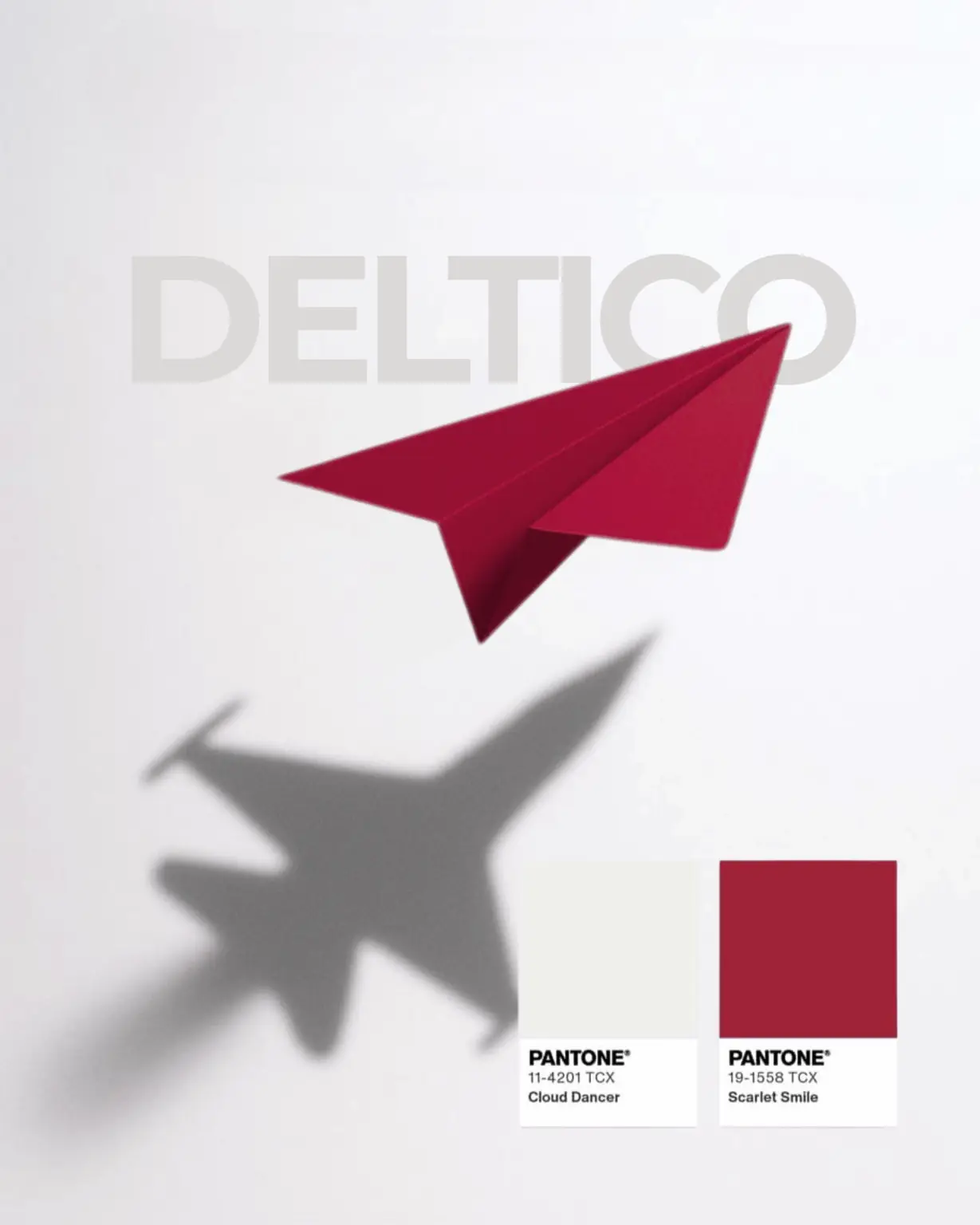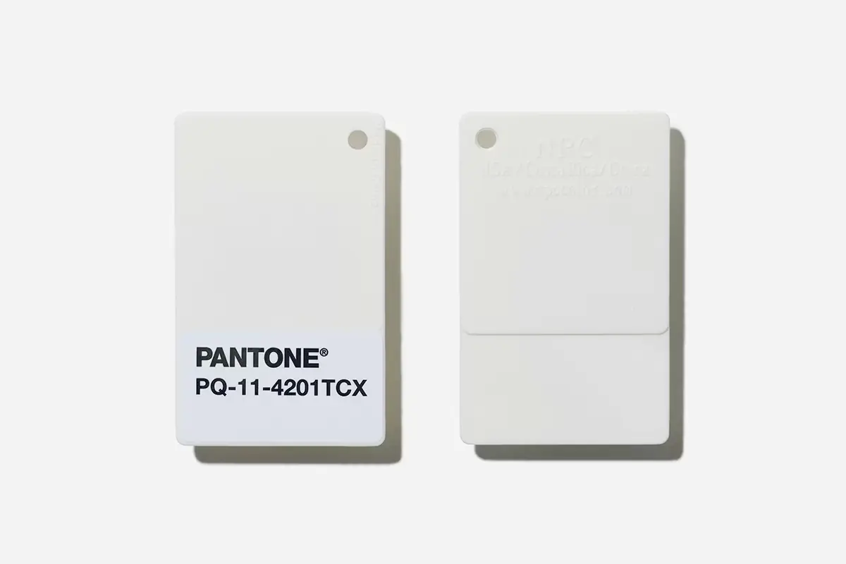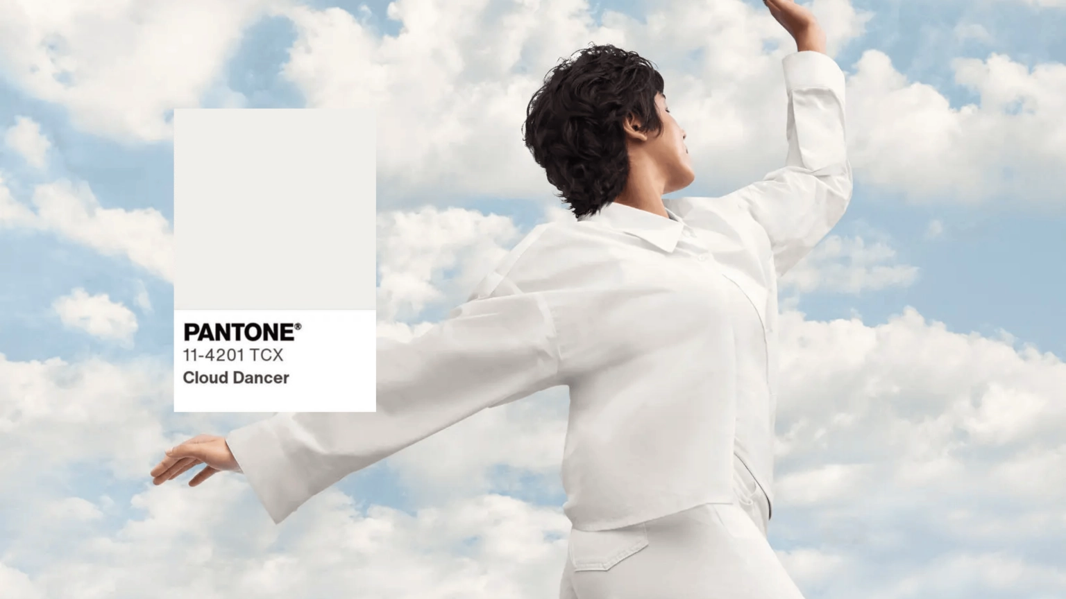
For the colour of 2026 Pantone chose a shade called Cloud Dancer – a very light, neutral, almost white colour that is not “sterile white” but has a soft, airy tone. This choice is unusual because Pantone rarely picks neutral tones as the colour of the year – it is usually a strong, expressive shade.
Colour of the Year 2026
For the colour of 2026 Pantone chose a shade called Cloud Dancer – a very light, neutral, almost white colour that is not “sterile white” but has a soft, airy tone. Cloud Dancer symbolises: – simplicity and clarity in a visual environment that is often cluttered with information – calm and focus in the “fun chaos” of the digital world – the feeling of a blank canvas that encourages creativity Pantone describes this shade as a colour that encourages reflection, clarity and a new beginning – the idea that aesthetics can calm down and that design can become a space for focus and purpose. Every year the Pantone Color Institute chooses the colour it considers a symbol of global cultural, social and visual trends, and in this case it is the global tendency for visual “calm” to become valued at a time when digital attention is fragmented.
How is it used in design?
How is it used in design? Forbes points out that Cloud Dancer: – can work perfectly as a background colour in web design and UI because it does not distract – lets accent colours and content “breathe”, i.e. lets other design elements be the focus – gives a premium, airy look without a feeling of coldness
Criticism and reactions to the choice of the colour of the year
Although Pantone explained that Cloud Dancer was chosen as a symbol of calm, clarity and a “blank canvas” for creativity, the choice did not pass without reactions. Several designers, commentators and creative professionals voiced criticism and concern about the move. Some thought the choice was too neutral, even boring or unambitious, and that it does not reflect the energy and diversity many expect from a colour of the year.
There were also sharper comments: some critics pointed out that choosing a white shade at a time when the world's social and political dynamics are dealing with questions of inclusion and identity can sound “tone-deaf” to the wider context and social tensions.
One of the loudest comments was on social media: “The question is — is the colour even in the room with us?” — a question about whether this neutral colour reflects the real feelings and experiences of people today, or is just a marketing choice without deeper meaning.
Other commentators ironically called the choice “Pantonedeaf”, alluding to the word tone-deaf and criticising Pantone for not being aware enough of the social context in which it operates. On the one hand, such reactions show how much colours – especially those that take on the role of a cultural symbol – can carry deeper connotations. On the other hand, the debate around Cloud Dancer also shows how subjective and ambiguous visual communication and aesthetics can be.